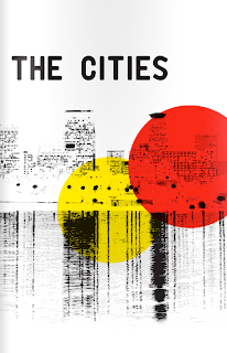
There's half of my Spanish vocabulary right there...
If you are ever sad, lonely, feeling tired or unmotivated...listen to this song...I can't promise you'll get anything done other than some dancing and acquiring a desire to grow a mustache, but you'll feel better!
Throw on a straw hat, grab a margarita, and stuff your face with guacamole, it's time to get spanish!

Thursday, June 30, 2011
All The Cool Kids Stay Out After Dark

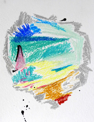
This piece was inspired by a few things...the beach sketches from last weekend, the Egon Schiele painting from a few posts ago, and the fact that after looking at the inspiration v. what I came up with, I was very disappointed. It's funny, I swear I liked that old house with the flowers when I did it, but now...it just seems completely out of sorts with itself.

Now you could say the same thing with the top, newer piece. It's got tons of different colors, swatches of blue, next to red, light green with purple, and a brown triangle rising from nothing with a sky full of dashes and scratches. But instead of feeling like a giant pile of trash i see depth, moodiness, perspective and an overall consistency with the application of the marks across the painting. In the single house piece, the darks are applied with such a different touch than the flowers that they just don't make sense together. They are so distinctly different, plus the fact that they are in no way integrated with each other, that it almost seems like one of the parts must not be finished...like I stopped before covering the rest of the canvas...not good.

Such is the life of me as an artist....you like what you did for approximately ten seconds, paint over it a few times, get distracted by a dying mouse outside for a while (see mouse post) and eventually you come out with something that's pretty cool. It's almost like I know what Im doing.
Photoshop is COOL
IT's a fact! and the even better fact is that you can pretty much learn how to do anything with it just by looking up the desired effect on the internet. And you can take it from me, I missed the first two years worth of computer studio classes (the one where you learn how all the tools and stuff) and still get along just fine. Now that doesn't mean the effect will be perfect or that it will be a simple 10 step process. Some tutorials only work with specific types of photos, some effects just simply don't work out as well. But knowing the tools general effect is half the battle...once you realize what they do, you can continue to tweak the setting for all eternity, always finding new ways to make things happen.
Anyways, it's a great tool for anyone that is doing anything artistic.Whether you simply are touching of photos of your work or completely manipulating them, you will find that the more options you have with your work, the better and most true to original idea you can get. Here's something I did today...nothing spectacular or groundbreaking, but it's a cool effect that took about 15 minutes of fooling around...check out the link to the tutorial below as well.
 http://abduzeedo.com/sparkling-hot-girl-photoshop
Anyways, it's a great tool for anyone that is doing anything artistic.Whether you simply are touching of photos of your work or completely manipulating them, you will find that the more options you have with your work, the better and most true to original idea you can get. Here's something I did today...nothing spectacular or groundbreaking, but it's a cool effect that took about 15 minutes of fooling around...check out the link to the tutorial below as well.

Most Beautiful Cars
Ran across this list today and I have to say, those are some mighty fine looking cars for the most part...but I really am just spellbound by the inclusion of the hyundai elantra. I mean, it's not ugly or anything, but if your standard for beauty for the rest of the list is Bentley's, Audi's, and Ashton Martin's, I don't really see how you include that. Even if you think it's a nice looking car, it is not even CLOSE to the same level as these other cars.
Whatever, I assume they were trying to put something in there that was actually somewhat practical and realistic...but come on...for serious...hyundai?...your not fooling anyone.
I can picture those Hyundai Elantra owners licking their chops now...break that thing out on the vegas strip and you'll be king for the night!
http://editorial.autos.msn.com/slideshow.aspx?cp-documentid=1175094
Wednesday, June 29, 2011
The Mouse by the House
So i have a completely irrational fear of mice...not all mice just mice in and around my house. And it's not just an annoyance, its a legitimate fear like "jump on the furniture throwing thing" fear. So you can imagine my displeasure when I got home last night and there was this little bastard being half dead in front of my house just rolling around by the curb. He either had his brains scrambled by a bike or had rabies, but either way he was just there to scare the F out of me...
I can picture him now. His stupid little beady eyes watching me walk slowly up the steps, waiting for the door to crack open so he can lose his "rabies" act and rocket between my legs into the nearest storage area. THEN he's just gonna chill in the dark till my footsteps no longer grace the living room, creep out of his hiding spot and leave little baby mice all over the apartment just so they can grow up and eat my toes while I sleep...What a DICK!!!
Im mean come on! Why does this little thing decide to start dying directly in front of my house, out of the million houses around Milwaukee! Furthermore, why does he have to take so long? So I extend a plea to the little dude...get away from my house or you risk sending me into an anti-mouse insanity fueled rampage without any regard for my own safety or the safety of anything even slightly resembling a mouse....
FOR SERIOUS mouse....
Book Cover Parade
Hey all,
I dunno if you didn't know this, but I'm pretty cool and do a whole lotta random stuff to keep my mind occupied. Some of the less productive things include video games, pacing, long walks on the beach, practicing "rock paper scissors" and being afraid of mice, but I also find some time to do more interesting things like writing and designing books. In fact, my little "group" has completed 12 short stories, ranging from 12 to 40 pages, written by various authors and designed by me. Take a look at the Covers below and check out anything that looks interesting...http://issuu.com/marionc


I dunno if you didn't know this, but I'm pretty cool and do a whole lotta random stuff to keep my mind occupied. Some of the less productive things include video games, pacing, long walks on the beach, practicing "rock paper scissors" and being afraid of mice, but I also find some time to do more interesting things like writing and designing books. In fact, my little "group" has completed 12 short stories, ranging from 12 to 40 pages, written by various authors and designed by me. Take a look at the Covers below and check out anything that looks interesting...http://issuu.com/marionc


Tuesday, June 28, 2011
Inspiration or Degradation
Last week I wrote a quick blurb about Egon Scheile and a piece of his that recently sold for a whole bunch of money and I actually really liked the piece. I thought it was a really interesting way of depicting such a blase scene, contrasting the colorful clothes with the dark and dreary earth-tones of the surrounding village and countryside. WELLLL as art often does, that piece inspired me. I just loved how the monotone threw the colors forward, giving them a life that would never come from a more evenly colored piece. Anyways, so I took that piece and created something that, while different, has a very similar aim.

 Now Scheile's is far and away better than my piece (and will be even when mine is done). The colors, while vibrant, link to the earth tones while mine seem to be disconnected, floating on a different plain, almost from a different world. As I continue I hope to see them link back to the browns, oranges and forest greens of the house. Also, I look to bring a little more light and depth into the house and background. While I like the "moodiness" of the piece, it sits on just two plains, the flowers in front, and the house and background smash together as one.I would like to see a much more harmonious flow that continues farther and farther back into the area within the canvas.
So anyways, Im going to try to get this one to the next step tonight but thought you might enjoy taking a look at a mid-way process and critique of trying to create a piece good enough to say that it "takes inspiration" from someone as good as Scheile. Hopefully, with a lot more work, I won't be degrading Scheile with the comparison.


So anyways, Im going to try to get this one to the next step tonight but thought you might enjoy taking a look at a mid-way process and critique of trying to create a piece good enough to say that it "takes inspiration" from someone as good as Scheile. Hopefully, with a lot more work, I won't be degrading Scheile with the comparison.
Everything Looks Perfect From Far Away

This is one of the pieces stemming from my series of sunburn sketches. I wanted to make a representational piece of the beach without really showing anything at all. I took the colors and didn't really link them to line, form or even the barriers of their own physical being, making a sort of "impression" of the overall appearance of the beach, not the specific beach-goers. Almost like a photograph with the shutter left open. You don't get the vibrant, punchy and energetic pops of color that some objects on the beach actually had, but, a more relaxing, semi-cloudy landscape. Yes the sun was out and shining fully, but the day was relaxed, the beach spacious and the feeling subdued. There weren't a hundred kids screaming, a bunch of college kids drinking, or massive games of pickup football, instead the people were just lounging, enjoying the sun, and enjoying the outside for what it actually was, not what it allowed you to do. Granted that was the feeling from 100 feet up on a hill, looking down at the people below, but as (name that band) once said, "everything looks perfect from far away." I think I'm fine up here for now.
Danstradomas!
 |
| Oh silly justices...you should probably stick to golf |
Who knew that I could channel future events through my illustrations! It seems that my cartoon of Prosser boxing Kloppy was frighteningly accurate, though the opposing fighter changed slightly. If you haven't heard by now, news has emerged that Justice Prosser, that guy who recently won his justice seat after a weird mix-up of vote counting, was involved in an altercation with fellow justice Ann Bradley during a meeting.
Bradley, a democrat, claims that the republican Prosser "put his hands around (her) neck in anger in a chokehold." While she is supported by fellow democrat, the other justices seem to be less sure what happened. Prosser's story is that Bradley approached him with fists up and he put out his arms in defense, supported by some other justices, one of which went so far as to say "you were not choked" to the accuser.
No matter how this plays out, it doesn't look good...but with how sketchy and different the accounts are, I would suggest holding off on the attacks until the investigation is completed. Read the big ol' story below.
http://www.jsonline.com/news/statepolitics/124605454.html
Monday, June 27, 2011
2 in a row
SO for those of you who didn't know, ex-illinois governor Blagojevich had been charged by the feds a while back for a whole lotta bad stuff including trying to sell or trade the vacant senator seat of current President Barack Obama, which he vehemently denied throughout the process. Well he just got found guilty of 17 of 20 counts following his second trial, the first of which ended in a deadlock. He faces up to 300 years in prison (which is ridiculous and WILL NOT happen) for the crimes, setting an interesting trend. Two governors in a row for Illinois now find themselves in or going to the correctional system. Anyways, it's no surprise to any of us that politicians are corrupt, but it's nice to see some of them get what's coming to them.
Story below:
http://beta.news.yahoo.com/jury-convicts-ex-ill-gov-blagojevich-retrial-191413841.html
Story below:
http://beta.news.yahoo.com/jury-convicts-ex-ill-gov-blagojevich-retrial-191413841.html
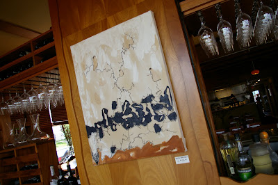
The Buffalo Run
Well this is one of my favorite new pieces as of 20 min ago. It's called The Buffalo Run and is probably my most obvious reference to primitive man and his art that I have ever really done. Usually I reference the mark making, earth tones or general "expression" to make the link but with this piece I decided to do something that was both representational as well as a look into the spirituality of the people back then. This specifically speaks to native americans and their reverence toward the Buffalo, seeing it not only as something they can use to survive, but something they were blessed with and, while using it as a source for many things, respected it for all its power and life. It truly was a different way of looking at the world around you and was an interesting concept to try to display in a painting.
Anyways, I thought it turned out pretty darn well and am very pleased with the outcome...at least for now (painted over "The Dragons Bow" from last week)
Anyways, I thought it turned out pretty darn well and am very pleased with the outcome...at least for now (painted over "The Dragons Bow" from last week)
 |
| The Buffalo Run |
Not all violins are created equal

I dont know much about the construction of musical instruments. Correction: I know next to nothing about the construction of musical instruments, and so tidbits of knowledge like the following just fascinate me. Apparently there was a maker of violins whose creations are considered the best in the world and are still unmatched (supposedly) in their sound quality. Stradivarius violins, or violins made by the Stradivari family, are said to have the best sound for reasons that escape modern technology. The building techniques have long been disputed, questioned, and the "uniqueness" of the sound has even been debated. Basically no one knows exactly how the things are made or why they have such a "great" sound quality, but that uniqueness has brought them to the level of "art" according to some people, and according to auction houses.
One from 1721 just sold for 16 million buckeroos, with the money being donated to help the japan relief effort. Awesome in both respects...anyways...nothings cooler than learning fairly worthless information about things that have no effect on you...check it out
Stradivarius Info
Story
How to get a good Sunburn
I fell in love with the beach again last weekend and after slamming three BEASTS I decided to join in on an ultimate game and, despite my lack of in-shape-ness and obviously inebriated state, I F-ing dominated! 3 or 4 passing TDs, 4 catching TDs and about 20 blurry minutes later, I was not only considerably more drunk than when I started, about to pass out from hyperventilating, but also remembered why we spent about half of the 2009 summer here. It's freakin awesome!... I also remembered that I burn pretty easily...


Anyways, I went back to a nearby park Sunday around noon to draw for a bit and actually came up with a few pieces that weren't too shabby. Although they are mostly jsut little sketches, they served as a good jumping off point for two larger paintings that I started last night. So toasted back and all, I braved some more sun (big mistake) and got some good work done (yay!). Next time I'll have to bring some larger surfaces to work on...and some sunscreen.


Friday, June 24, 2011
Nike Wants us to "Get High"
A new ad and apparel campaign by Nike targetting skate and snowboarders removes the regular "just do it" and replaces it with phrases such as "dope", "get high", and "ride pipe" and, unsurprisingly, has faced a good deal of backlash from anti-drug organizations. Nike defends the campaign by saying the phrases are lingo regularly used in the extreme sports community and do not directly mean "use drugs," but refer to the sport with drug references. Anti drug groups are obviously pissed saying that, despite the "extreme-sport" meaning of the words, the actual-life meaning of the words suggest kids use drugs. Many kids will see the shirts with no experience as to what the slang meaning is and might connect the company and the campaign, as well as people wearing the clothes to the use of drugs.
It's a tough situation since the words are obviously not meant to suggest the use of actual drugs, but the phrases legitimately are connected to drug use. It may be the lingo of extreme athletes, but it's also the lingo of drug users. In a society where drugs are so prevalent, you would hope companies would recognize the possibility for the words to be misunderstood or misinterpreted. While I don't particularly have a problem with it, I can definitely understand why so many people do. The one main thing here that I don't particularly like is that Nike is basically saying that, as long as it's regularly used slang for something else, you can use it. I have a hard time believing that if "fag" or "queer" became regular slang in a sport that it would be used as a campaign slogan, but according to this, it wouldn't be out of the realm of possibility. I guess I can see where they are coming from...no one thinks the QB is actually praying if the announcers say he throws up a hail mary. But then this is in reference to drugs...something that can have devastating effects on any family anywhere and needs to be treated accordingly.
I don't think it will directly lead to any huge new drug problem at all, but I don't think NIKE looks good in any of this. It just kinda seems out of touch. Yes there is a group of people who regularly use these terms with no correlation to drugs, but there is a significantly larger portion of people who primarily or exclusively connect these phrases with drug abuse.
Let's make an obvious example. The swastika is the symbol of the Nazis most recently, but for a long time was a symbol meaning "well-being" and was used for centuries across the world. If I walked around wearing a shirt with a giant swastika on the front, I'd be labeled a racist, neo-nazi, skinhead and all that stuff. If I responded with "no, its the swastika from ancient india meaning peace" they'd just stare at me. The fact is that it means something bad to such a large amount of people that no matter what I meant to reference, it still signifies evil. I can't deny that simply because I was using it from a different context. I think Nike should maybe view it through that type of lens. If they see and understand that issue and don't care, that's up to them. But to deny the fact that people will be justifiably offended because you are using it in the "extreme-sport slang" way is a pretty close-minded and out of touch view.
Read the article below:
http://www.cbssports.com/#!/general/story/15262550/nike-faces-antidrug-backlash-to-tshirts
Big Trucks and Little Kids
I can finally call myself a true american...I spent the day yesterday at a NASCAR event taking photographs for a client and might have gone a little overboard. I don't know about you, but 886 pictures seems excessive. If I can't find a good one in there, I should probably look for a new job. Anyways, here are some cool/cute/funny photos from the event which featured 30 NASCAR haulers on their way to the Elkhart Lake race.


 |
| Like a Boss |
 |
| How the hell'd a car get in here |
 |
| What about it fool? |
 |
| Burger Truck=Best Truck |
 |
| Couplabadasses |
 |
| Coat tucked into skirt? Check |
 |
| Not Impressed |


Egon Schiele

One artist that seems to get overlooked by the general population, or at least hasn't found the same widespread fame and recognition as some of his turn-of-the century counterparts is Egon Schiele. His career was short-lived, cut down by the Spanish flu epidemic in 1918, and for people who don't immerse themselves in art history, he seems to fall through the cracks of the modern art movement.
Well he recently broke his own record for a piece sold by the artist. It's a melancholy landscape, intimately constructed and beautifully laid out in a rather "folk-arty" style, with brief marks of vibrant color breaking up the dingy-ness. In such a dark landscape, the bright dashes and marks standout, almost representing the people within the quaint city homes, taking on the life that the barren ground and rustic earth-toned homes lack.
Anyways, he really is one of my favorite artists...look him up and check out the article below.
http://today.msnbc.msn.com/id/43501002/ns/today-entertainment/
Wednesday, June 22, 2011
Paint the Bastille!
 |
| The French love this impressionist shit! |
Bastille Days returns to Milwaukee in a few weeks and despite the fact that the coolest thing there, no doubt about it, is the 20 ft tall eiffel tower, there are some other good things to do. No we don't get to storm any cliff-side castles or use a bidet, but what you can do is drink a milwaukee-man's amount (approx. 12 beers) and watch me paint! I will be doing some live painting on Saturday the 16th from around 1pm-6pm at the Art Milwaukee Tent and possibly on sunday as well. It should be a great time with sun, live music, a lack of anything really french, and a bunch of drunk milwaukee people...oh wait, that's what everyday in the summer here is like. SO as long as the organizers don't surrender first, plan on coming down to Bastille Days in Milwaukee from July 14-17th. There's a mini eiffel tower, beer and me! If that doesn't get your heart-a-racin' you are in the wrong city.

Sima Cunningham - "Danny"

Alright so this is the last song of the day I think, maybe, probably not. But it is a really good one and its actually by Chicago based singer/songwriter Sima Cunningham. I was introduced to her, and specifically this song, by someone who actually knew her back in Chi-town and went to school with me at MIAD for a year. And while there are a lot of really good local music acts around, this song has always stuck with me more than any other. I have absolutely no idea about the back story of the song, but the lyrics are beautifully sad, her voice is really unique and the extra flourishes of instruments keep the song from bogging down. I can honestly say its one of my favorite songs and more people need to listen to this super talented lady.
PLUS she just released a new album so everyone should listen to all her other songs as well. To listen to the song click "music" and then the "listen" button next to the song "Danny."
http://simacunningham.com/home.php
Samson
Not only is this a great love song but the video is really well done and very cool. It melds animation, stop-motion, origami and paper art to create a visual landscape that delicately follows the story along. Not a song to be taken lightly, the monochromatic blues match perfectly with the dark nostalgia, but the delicate paper and light-hearted stop-motion give a positive outlook, without crossing to the "cartoony" or kitch-ness that stop motion can sometimes give. Take a look:
Controversy at the Continental.
Well this one hits close to home and it appears that no one involved is happy. At Gallery M, a space at the Intercontinental Hotel, a MIAD student curated show has created some buzz when the higher-ups requested that my former teacher, Fahimeh Vahdat, alter her piece so that it was more appropriate for the setting. Even more that the piece was about the oppression of women in Iran. Censorship of socially involved work never seems to end well.
Now the piece isn't that "vulgar" in the least. it depicts a nude women with arms out under layers of red, but nudity is always something that has some very different opinions. I can see why a large hotel would not like something potentially offensive in or near the lobby. The hotel even seems to have suggested that it be covered before the show, but open for viewing on the night of the opening.
Now here's where it gets "opinionated." There are some people of the view that no art, anywhere should be censored. That we all have the right to put up anything we want, and if an institution doesn't respect that right, they are oppressive, close-minded, and against the freedom of expression. I respectfully disagree. While censorship is usually a negative thing, the gallery belongs to the owners and whoever showing in that gallery is subject to their rules. While it's too bad that the hotel decided the piece was not appropriate, it is completely within their right to do so. They are running a business and need to make decisions that are proper for their own well-being. My question when things like this happen are, "why didn't the artists have guidelines?" And if they did, why weren't they followed? If the guidelines didn't cover issues like this, THEY SHOULD. Nothing is more disheartening than taking a piece down that you feel is successful and important and there's not a whole lot that looks worse for the gallery than "censoring" an artist, whether or not that is actually what they are doing.
It's a tough situation. The hotel doesn't want to offend guests, the gallery director doesn't want to censor its artists, and the hotel is the parent company. Basically the gallery has to do what its told and the larger institution will usually stand on the conservative side. The best thing you could probably do is work with the artist to show the piece as well and completely as possible without souring relations with the hotel.
The fact is that it is a hotel lobby gallery and not MOCA. It is probably not the best and most welcoming place to make a dynamic statement. I understand the concern for the freedom of the artist, but also the rights of the hotel to approve the work that is shown. It is a mentorship-type agreement they have with MIAD, donating 5,000$ to their scholarship fund and allowing up-and-coming artists the ability to show at a visible downtown space to a wide variety of people. I don't believe they are purposefully silencing the artist, in fact I don't think it has anything to do with the message of the piece. It's simply taking the complaint of one guest and deciding that removing one piece of art that is potentially offensive is easier than the possible displeasure of a number of paying guests.
I just really hope people don't turn this into something bigger than it really is. I understand the frustration, it's a difficult situation, but I don't feel they are oppressing anyone and no one took the piece down for it's political message. It's simply a preventative measure taken by the hotel in hopes that they don't have a problem later. It's sad that a great artist is forced to alter her work and it won't be seen as intended, but I don't see this as a blight to the cause. It's the reality of showing in a rather public space.
Read the whole story from Art City below.
http://www.jsonline.com/blogs/entertainment/124082334.html
Tuesday, June 21, 2011
The CHINA exhibit
I finally made it to the China exhibit and Lakefront Art Fest last weekend and was actually very impressed. Firstly, I had heard the Lakefront Art Fest was usually a let down historically. A lot of crafty, cliche art; sprawling prairies and Wisconsin north-woods, but it was actually pretty interesting. There was a great variety of work from pop-art to surrealism to more traditional landscapes. Everything from acrylics to sculpture and digital media were present and frankly, I don't remember another time I had been interested in so many different artists at one show. There are way too many artists to really critique the show, but I definitely suggest it to anyone next year.
 The China exhibit was also a great look into a very specific part of chinese history. All of the pieces seemed to come from one time-period, designed and built for a specific mansion-sized retreat. From beds and stools to tapestries windows, clocks and even European art, the show encompassed a large amount of objects, painting a fairly complete picture of the palace. My favorite piece was a sixteen panel, double-sided separator which bore "caricatures" of the sixteen disciples of the Buddha. The old men were gnarled, wrinkled and deformed, thought to represent that outward appearance did not portray religious piety. The forms were almost gargoyle-like in appearance, contrasting how religious figures in western culture are depicted, and taking them off of the pedestal to a more human level. The backside of the panels bore intricate inlays of symbolic plants, a much more peaceful and relaxing scene than the opposite side.
Much like the Frank Lloyd Wright show, I felt that this was more of a historically informative show than artistic. I wasn't gazing into the pieces, trying to see what the artist was seeing or trying to say. I was reading the panels, learning the history and trying to understand the reason for the objects being how they were. It wasn't an emotional journey into Chinese culture and art, but a documentarian sort of walk through; catching little tokens of info and connecting it to my overall understanding of the chinese culture. And so, it depends what you are looking for. I hadn't read much about the show and was expecting a more artistic show, spanning the centuries and comparing modern and chinese art. While I didn't get that at all, I wasn't disappointed. There were many great pieces and a lot of great knowledge to be taken in. I might not have been inspired to go paint or work, but i did feel like I had a stronger understanding of some of the more specific practices of that time.
If you are looking to be inspired by the elegant calligraphy, beautiful watercolors and dynamic woodcuts of Chinese art history, you may be disappointed. But if a "History Museum-esque" walk through of a 17th century Chinese palace seems like something you're interested in, it's definitely worth a look.
Again, the pieces are beautifully done and presented. They all hold great value and historical significance and are a wonder to look at and investigate, they just are more in the category of "decorative arts" than what I would see as "fine art." In no way am I trying to devalue these objects or the collection, it's just the difference between a beautiful chair, and a beautiful painting. I personally get more in the painting and approach the two differently. Anyways, get there if you can...definitely worth seeing and definitely a great resource for the curious mind.
Overall Grade - B
What a pretty little mistake you are!

Conceal and Carry
So this is getting everyone all hot and bothered.
"it gives the public the opportunity to defend themselves!"
"It will lead to more random shootings and accidents"
"it puts more guns in society, that's bad."
"the people using guns illegally are buying them illegally."
"any random crazy person can buy a gun!"
"Now Im afraid to walk down the streets!"
SETTLE THE FUCK DOWN!
Whether you agree with the bill, disagree, like guns or not, you should educate yourself at least a little bit.
-48 other states already have conceal and carry laws. It's nothing new, it's nothing crazy.
-Wisconsin and Illinois are the only states yet to allow some kind of conceal and carry.
-Wisconsin's previous/current law was open carry. Meaning the public has been allowed to carry guns, they just had to be easily visible and outside of your clothes
-The bill requires you to have a background check and take classes. Felons will still not be able to legally have guns.
-They are not allowed in schools or other law enforcement related facilities
-Signs can be posted on private residences and business banning guns.
-Signs can be posted on govt. buildings (the capitol) but not govt. owned grounds(city parks)
-Permits and photo ID must be held by gun carriers when carrying a concealed weapon.
-The Permits also would allow tasers or other electric weapons.
-Holders must be over 21
-Permit holders could bring a weapon into a bar, but they would not be allowed to drink.
-Most data and research says that concealed and carry laws have little to no effect on violent crimes. There is not the feared increase, nor is there a significant decrease.
SO! now that we have some (really) basic info, go ahead and make your judgement. If you think guns are the devil or need to carry a gun cuz your dick's too small, these facts probably won't have any effect on your viewpoint. For the rest of us, hopefully we can start to put together some informed ideas, criticisms or praises about the bill and, either way, at least we know a bit more about what's going on.
Damn it feels good to be a gangsta...
Why is it that even I, a goofy, artistic, twenty year old white guy, loves this song? I don't know what its like to be a gangsta whatsoever, but I'm gonna take these guy's word for it...sounds like it feels good.
Monday, June 20, 2011
Roots: take your lady friend and be impressive
Went to take photos at Roots for the paper last Friday and it's a really cool place. They have really good decoration and some solid art around the whole place, not to mention the food looked fantastic. It's a bit pricey so I doubt I'll be going unless I manage to finagle a date at some point, but if you want to impress your special lady you might wanna check it out.


Open Gallery Call, Gallery Night July

My gallery, Gallery 218 in the Marshall Building, is accepting entries for a juried show to be held on Gallery Night in July. Entry fee is 21$ and work and application are due July 2nd! Read through and complete the application and please hand work and app in at the gallery Wed-Sat, 12-5 pm. Space is limited and an award of a 6 month membership to show at the gallery will be given! Take part in another great gallery night at one of the best gallery buildings in Milwaukee!

 |
| Sorry, It won't let me attach a file |
Subscribe to:
Posts (Atom)