I thought, with the massively productive year I saw pass by, I'd go through and put together a list of favorites from the year of work...take a look and let me know what you think...what would you add, what would you delete? What do you think about the year of work altogether?
I find most "best of" lists to be a rather frustrating example of "most popular" instead of what actually was the best, most innovative, or most interesting....and so I don't think this list is should be taken as the definitive "most successful works of the year"...but the exercise itself forces the artist to take a look at each piece and, at the very least, react. So, rather than a "best of", perhaps this should be thought of as a"most important" or "biggest standouts" list....
Comments to be added as I go through the list...enjoy!
 |
| This is an all-time favorite that touches on a few key subjects throughout my work...the outside, alternative perspective compared to the understanding of a scene by those involved...a slight religious angle..the black silhouetted figure...a nice piece that brings some common elements from the year together. |
 |
| Another all-time favorite, as that seems to be a trend this year. This was one of my most "symbolic", using some religious imagery along with titling to pose a question on self-sustaining v. faith in something greater. |
 |
| Moving West was the first piece for the "Sacred Wilderness" Show at the beginning of the year...my first purely abstract piece in a while and the first that really used a minimal palette. |
 |
| Again, from the "Sacred Wilderness" show, this was the most "edgy" piece which I think had a distinctly unrefined effect... |
 |
| Cloud Kings...maybe the most successful from "The Sacred Wilderness" while probably standing as my most minimal large-scale piece yet. |
 |
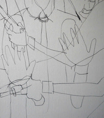
| This piece stands out as the only real large-scale drawing I've ever done...and though i haven't yet continued the practice, the success of this piece has really kept it in the back of my mind as a possibility for a future collection... |
 |
| This was one of the first pieces I did where the space in the piece was...undetermined. The confusion of depth has become a much more regular component of recent work, but being done even before the summer, this piece stands as the one of the first and best examples... |
 |
| My first hinged canvas...and, at the time, the largest piece I had worked on. It's rather simple...which I like...and rather subdued in color scheme, which I also like. It's never really been shown, as it's not my most typical or likable piece, but it holds a special place in my heart... |
 |
| Love it. First piece on a door...never been shown in a gallery but I'm still young. |
 |
| Sometimes work just happens too easily and you almost fear it's too simple to really be any good...this was one of those times...but time has proven that fear wrong. |
 |
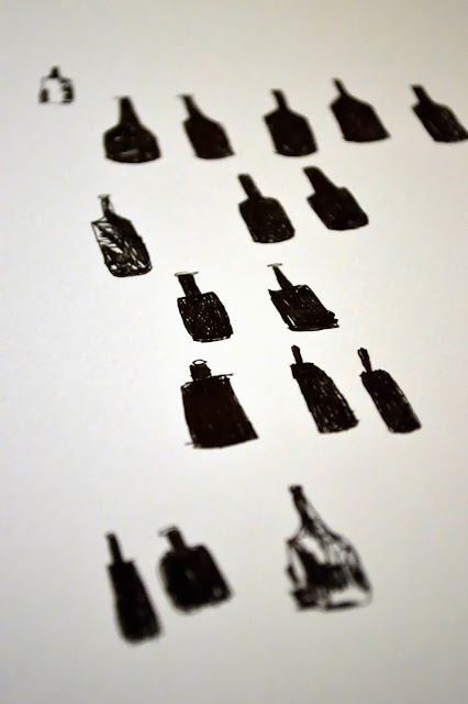
| What do you do with a clogged, broken and unusable screen-printing screen? |
 |
| It's a rare thing for me to go into a piece with a very specific artwork as inspiration in mind and for that piece to then end up actually resembling the inspiration in any way... even rarer for that all to happen and for me to end up liking it...and even rarerer that it introduces an idea like the "random" patterning that has so exemplified my work from the last few months. Truly a rarity in every respect...directly inspired, resembles inspiration, introduces new effects, leads to big changes, and the artist still likes it. |
 |
| I had a month-long obsession with turn-of-the-century boxing and this was the most successful piece of the bunch...still love the drama and the storylines from the period and was really amazed by the adversity these early athletes went through and what it meant for the people around them...waiting to see if inspiration strikes again...initially intended to have a show based on the series...maybe this year? |
 |
| I lied...this is the most successful boxing piece but it's the least obviously boxing-related...drawing the connection between the boxer and the butcher, this piece was regularly cited as the "most favorite" at my show in the Lighthorse Apts. |
 |
| a bit Sculpture, a bit painting, this piece was one of the most striking from the year and held it's own leaning against the studio hallway for the majority of it... |
 |
| I initially described this piece as "weird"...but I think I just didn't know how to feel about it since it had such drastic differences from some previous work...it's still a bit "weird" but also stands as the starting point for some recent techniques that have come to dominate the work. |
 |
| Painted live at a Halloween party, this was a favorite from the get-go. It had the excitement of the event and the carefree personality of the projector screen it was painted on...but also just a very nice composition with a unique subject... |
 |
| So where did all the patterning come from? Clue: this piece. |
 |
| Another "weird" guy...this piece stood as a completely different completed artwork for about 6 months before I nearly covered the entire surface with the teal...a few notes of the previous piece peak through (the foot near the top right) |
 |
| This one got lost in the fray and has never been shown, but it helped me get away from my singular subject motif that had become a little too prevalent. This piece really helped me change the scale of the subject on the canvas. |
 |
| And here's that singular subject motif, but done in an almost exasperated way...like I knew I had been tackling the subject too often and this piece was all that was left. |
 |
| Inspired by my most recent and most lucrative Open Canvas yet, this piece connected the dots between some of my abstract patterning and ink drawings... |
 |
| an experiment in multi-piece artworks, series and ordering, AERIALS was the main attraction at my biggest solo show yet at Gallerie M and my largest piece on canvas ever at 165x60". |
 |
| And to round out the list, a view of my first ever MKE mural on location at AERIALS in Gallerie M at the Intercontinental Hotel. The mural was written up in The Shepherd Express and was blogged by OnMilwaukee.com's tumblr page while leading to a potential 2nd mural currently in the works... |


